
In practice, the best luxury furniture color trends are not about repainting every room. They are about choosing a grounded base, adding one memorable accent, then balancing upholstery, wood, metal, stone, and lighting so the whole home feels intentional.
The Core Palette Directions to Watch
Use these directions as a design lens, not official forecasts. Color shifts are shaped by lifestyle, architecture, climate, and available finishes, so a premium home should translate trends into a tailored palette.
Warm Neutrals
Cream, sand, oatmeal, greige, taupe, and mushroom remain the safest foundation for luxury interiors because they flatter natural light and expensive textures. For 2026–2027, make them warmer, less gray, and more tactile.
Earthy Browns
Caramel, cocoa, walnut, tobacco, and espresso tones bring visual weight. They suit lounge chairs, dining tables, bed frames, and built-in storage where permanence matters.
Muted Greens
Sage, olive, eucalyptus, and gray-green upholstery feel serene without becoming bland. Pair them with oak, walnut, bronze, linen, or travertine for a composed resort-home mood.
Burgundy Plum and Sophisticated Blues
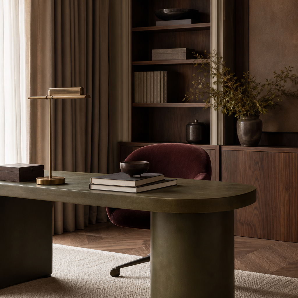
Deep burgundy, oxblood, mulberry, plum, ink blue, slate, and midnight blue work best as controlled statements. Use them on a sofa, headboard, occasional chair, or cabinetry interior instead of scattering them everywhere.
Tonal Layering: The Luxury Move
Tonal layering means using related shades rather than sharp contrast. A beige sofa can sit with a darker taupe ottoman, a coffee table in walnut, and drapery in warm ivory. The room looks nuanced because every color has a family relationship.
Upholstery and Wood Pairing
The color of fabric should be selected beside the wood finish, not after it. Pale woods make muted green, mushroom, and sand feel airy. Medium walnuts make camel, cocoa, and burgundy feel richer. Very dark woods need softness nearby, such as ivory bouclé, linen-look textiles, or blue-gray leather tones.
Quick pairing examples
- Warm greige sofa with walnut legs and bronze hardware.
- Olive dining chairs with a stone table and oak sideboard.
- Plum headboard with ivory bedding and dark espresso nightstands.
Lighting Changes Every Furniture Color
A color that looks elegant in a showroom can turn dull at home. Natural daylight reveals undertones; warm evening lighting deepens browns and burgundies; cool lighting can make beige look flat. Always test upholstery and finish samples in morning, afternoon, and night conditions before approving a custom piece.
Room-by-room use
- Living room: build from a warm neutral sofa, then add brown wood, blue art, or one plum chair.
- Dining room: choose woods first, then use upholstery to soften the architecture.
- Bedroom: keep the largest surfaces calm; place richer color on the headboard, bench, or bedside pieces.
- Home office: sophisticated blues and tobacco browns support focus without feeling corporate.
- Powder room or dressing area: try the boldest burgundy, plum, or espresso accent here.
How to Choose Colors That Will Last
Trend-aware does not mean disposable. The most lasting palette is the one that respects your architecture, floor tone, daylight, art, and daily habits. If children, pets, or frequent entertaining shape the home, mid-tone fabrics often hide wear better than very pale or very dark pieces.
For large investments, keep fixed items calm and move stronger colors to pieces that can be reupholstered or relocated. A custom approach also allows MCasa to coordinate furniture proportions, finishes, and color intent from the start.
Palette checklist
FAQ: Furniture Color Trends 2026–2027
What is the safest luxury furniture color for 2026–2027?
Warm greige, mushroom, camel, and soft taupe are safe because they coordinate with many woods, metals, and stones. They also allow art, rugs, and seasonal styling to change around them.
Are bold colors suitable for expensive custom furniture?
Yes, when used strategically. Deep blue, burgundy, or plum can be timeless on a sculptural chair, headboard, or cabinet detail. Avoid choosing a dramatic color only because it is new.
Should every room follow the same palette?
No. A luxury home feels more sophisticated when rooms are related, not identical. Repeat undertones, woods, or metal finishes, then let each room have a slightly different accent.
Summary and Next Step
The best furniture color trends 2026–2027 for luxury homes are refined, warm, and layered. Start with tactile neutrals, deepen the palette with browns, add muted green or sophisticated blue for calm, and reserve burgundy or plum for memorable moments. Test every shade with your real lighting and existing finishes before committing.
For visual ideas, explore MCasa furniture inspiration on Instagram, then bring your preferred mood into a custom discussion.
Work with MCasa to align color, scale, and finish choices before your furniture is produced. Your home deserves a palette that feels current, personal, enduring, and beautiful.