
Color is indisputably one of the most expressive elements in high end interior design. Beyond mere aesthetics, the right color choices dictate spatial flow, evoke psychological warmth, and highlight the intricate details of custom craftsmanship. In 2026, color palettes for high end residential interiors are undergoing a profound shift, moving away from cold, stark minimalism toward rich, nature-inspired tones that bring serenity, depth, and timeless opulence into modern living spaces.
Understanding how to layer these contemporary shades across custom upholstery, cabinetry, and structural elements is key to creating cohesive interiors. Here is an in depth analysis of the defining color palettes transforming modern luxury homes this year.
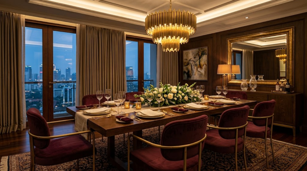
1. The Rise of Warm Architectural Neutrals
The era of flat, sterile gray undertones has officially given way to complex, warm neutral tones. Modern homeowners are embracing foundation shades that radiate warmth without appearing overly traditional.
-
Creamy Taupe & Warm Oat: These comforting shades form the ideal canvas for expansive sectional sofas, custom upholstered headboards, and full-height wall panels. They soften sharp architectural lines while keeping spaces feeling bright and airy.
-
Soft Mushroom & Sandstone: Offering a subtle depth, these mid-tone neutrals bridge the gap between light walls and darker structural elements, serving as the perfect backdrop for polished metals and natural stone.
-
Warm Greige: A sophisticated hybrid that retains modern clean lines while adding natural warmth, greige works effortlessly across custom joinery and cabinetry.
By serving as a versatile foundation, warm neutrals allow raw natural materials such as brushed brass, rich walnut grain, andveined marble to take center stage.
2. Deep Moody Accents and Saturated Tones
To contrast warm neutral foundations, modern furniture designs are leaning heavily into deep, jewel inspired accent colors. Rather than overwhelming entire rooms, these saturated hues are strategically applied to highlight key bespoke pieces.
Emerald Green & Forest Moss
Inspired by botanical landscapes, deep greens bring a grounding, tranquil energy into dining rooms and study spaces. When paired with rich velvet upholstery on dining chairs or accent armchairs, emerald hues create a striking visual impact against dark timber dining tables.
Rich Terracotta, Rust, and Burnt Amber
Reflecting earthy origins, warm terracotta and amber tones add immediate warmth and intimate energy to living room seating ensembles. These shade choices harmonize impeccably with matte black metals and warm wood tones.
Deep Burgundy and Plum
For those seeking dramatic luxury, rich wine and plum shades offer an aristocratic touch. Frequently chosen for custom lounge chairs, leather ottomans, or decorative cushions, burgundy adds refined grandeur without disrupting the overall color balance.
3. Harmonizing Colors with Luxury Materials
A color palette is only as impactful as the materials carrying it. In contemporary design, color and texture must be selected in tandem to achieve true visual harmony:
-
Matte & Gloss Interplay: Pair deep moody upholstery with reflective finishes such as hand brushed brass hardware or high gloss lacquer accents to prevent rich colors from looking flat.
-
Tactile Fabric Pairing: Rich jewel tones show best on tactile fabrics like bouclé, velvet, and textured chenille, where light bounces across varying pile heights to reveal subtle color depth.
-
Natural Wood Pairing: Warm neutrals pair exceptionally well with lighter oaks and teak, whereas deep jewel tones naturally complement darker walnut and smoked oak finishes.
Curating Your Personal Interior Palette
Selecting the right color scheme ensures your custom furniture seamlessly aligns with your home’s unique layout, lighting conditions, and architectural personality. Whether you are aiming for a serene sanctuary defined by warm neutrals or a bold, dramatic space punctuated by deep accent shades, thoughtful color planning makes all the difference.
Explore how bespoke finishes and tailored color palettes can elevate your living space by following our design showcases on Instagram.
If you are planning your next residential makeover or require tailored recommendations on custom materials and color schemes, feel free to get in touch with our interior specialists to bring your vision to life.